

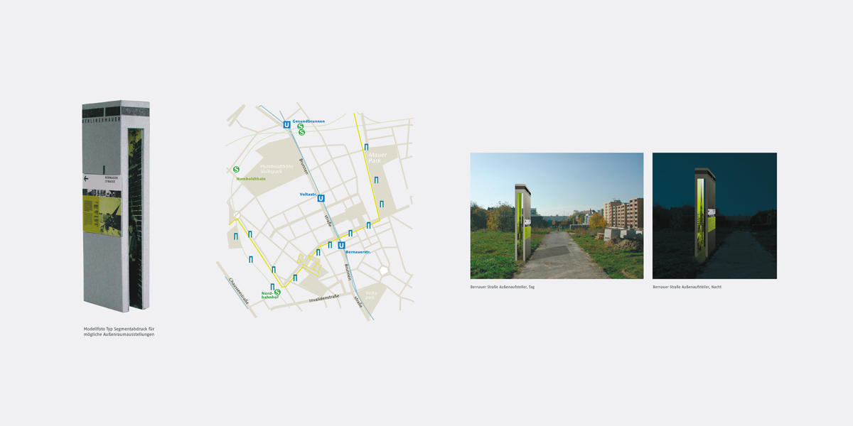
Background
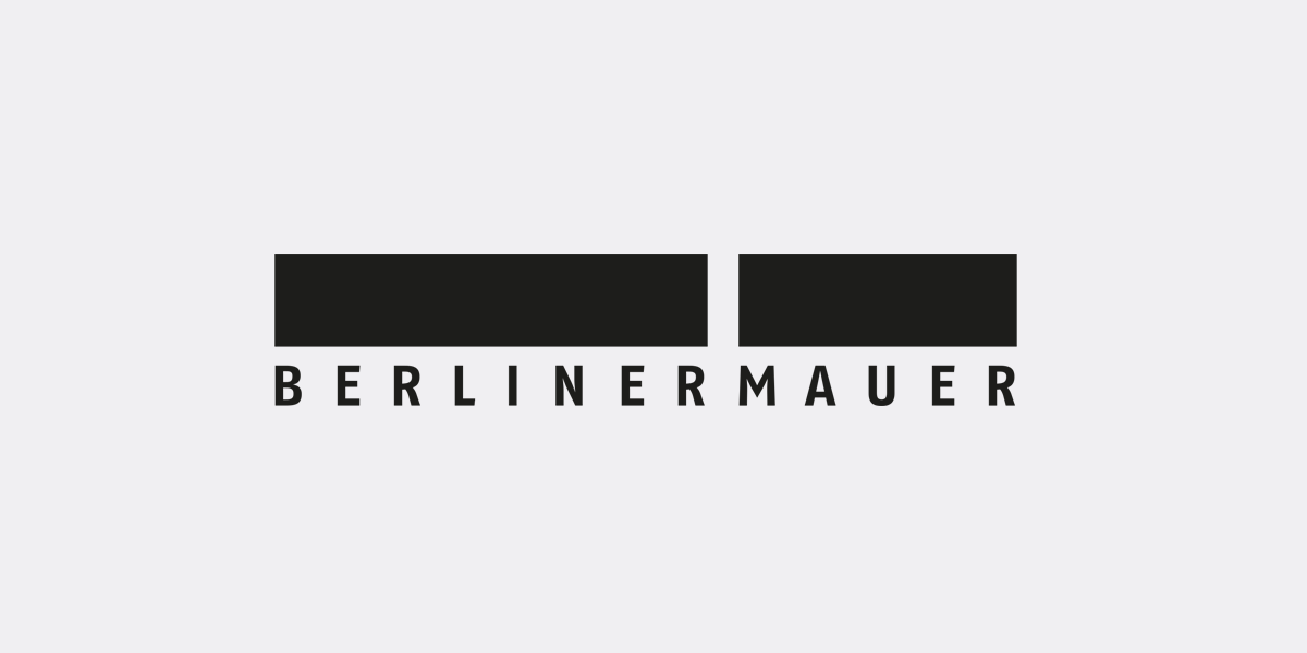
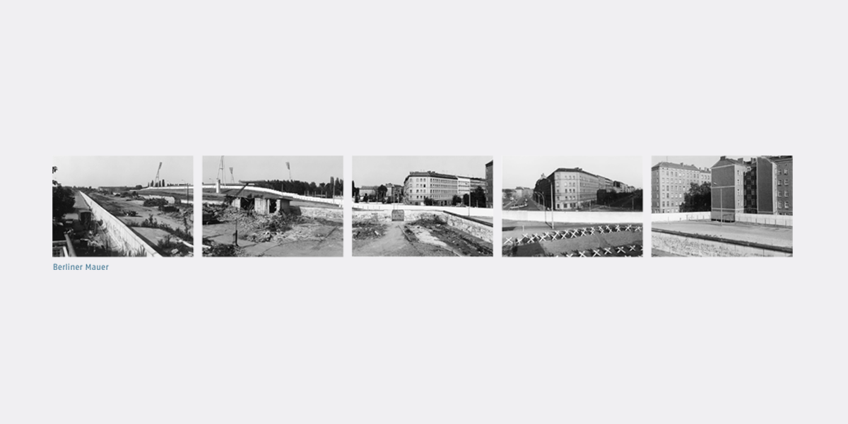
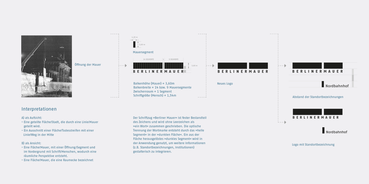
Starting point for gewerkdesign’s logotype for the Berlin Wall was a rectangle mirroring the proportions of the wall and corresponding with the words »Berliner Mauer«. Omitting one segment of the rectangle in between the words makes reference to the former division of Berlin into an eastern and western part, yet also the opening of the wall. The missing segment is repeated a little below the rectangle and can be used for including additional information like a place, an event, or a date.
The logotype was selected in an elaborate selection procedure by the Federal Government of Germany. It identifies all institutions subject to public law that are dedicated to the research and information about the Berlin Wall or the history of the German division. It is also used as a certificate for quality approved products and services of non-governmental institutions.
The Berlin Wall logotype was awarded the European Design Award in Stockholm 2008.
Tasks / Range of Services
Logotype design, brand design
Details
• Published: September 2008
• Client: The Federal Government
FCommissioner for Culture
Fand the Media
Related projects
• Jens Imig
• Stefan Rothert
• Birgit Schlegel
• Susanne Kluge
Photography
• gewerkdesign